Lyka - Homepage
Conversion Optimisation
For this project I was in a team of 12 UX students working for a real client looking into real UX challenges.
I was involved at every point along the UX process with the course divided in two sections as per the double diamond approach. The research phase was done as a team including - client & customer interviews, research and finding presentations. The design phase was done individually including - ideation, sketch, low to high fidelity prototyping and the final client presentation.
Below is a summary of the design process which documented from research phase, usability testing of my high-fidelity prototype all the way to final client presentation. A comprehensive PDF case study and Live Figma prototype are available upon request.

Screenshot during the initial Stakeholder interview
01 Empathise
Stakeholder interview
First step was to conduct a client interview where we learned about the product, their business objectives, competitors and identify the challenge from the client’s perspective.
UX issues was identified by the client as the main challenge on the current website which contributes to an average bounce rate of 44%.
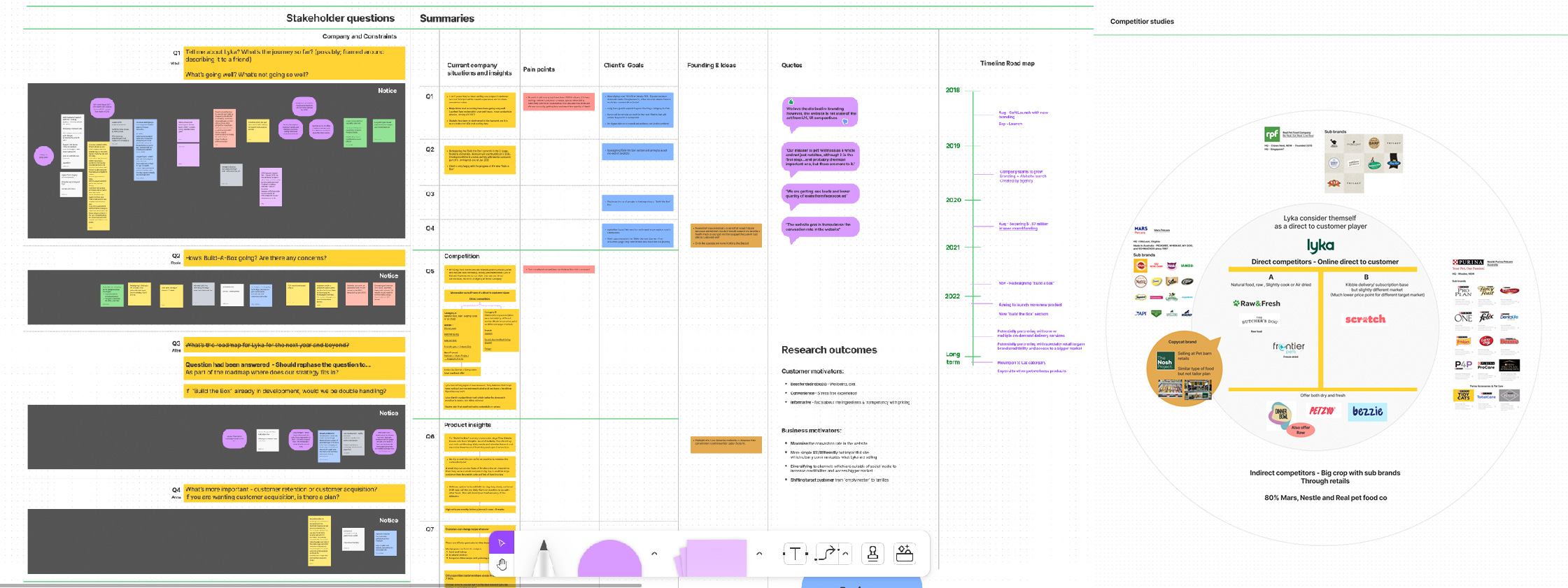
FigJam whiteboard of summaries from Skateholders' interview and competitor research
02 Conceptualise
Research & Customer interviews
As a group we performed in depth research on competitors to better grasp Lyka’s position in the market, Individually, we also conducted interviews with prospective customers including questionnaires to better understand their needs, perspectives in dog care along with a usability test on the current website. Upon completion, we regrouped and synthesised all our data using Figjam. We identified the trends and common pain points experienced by customers.
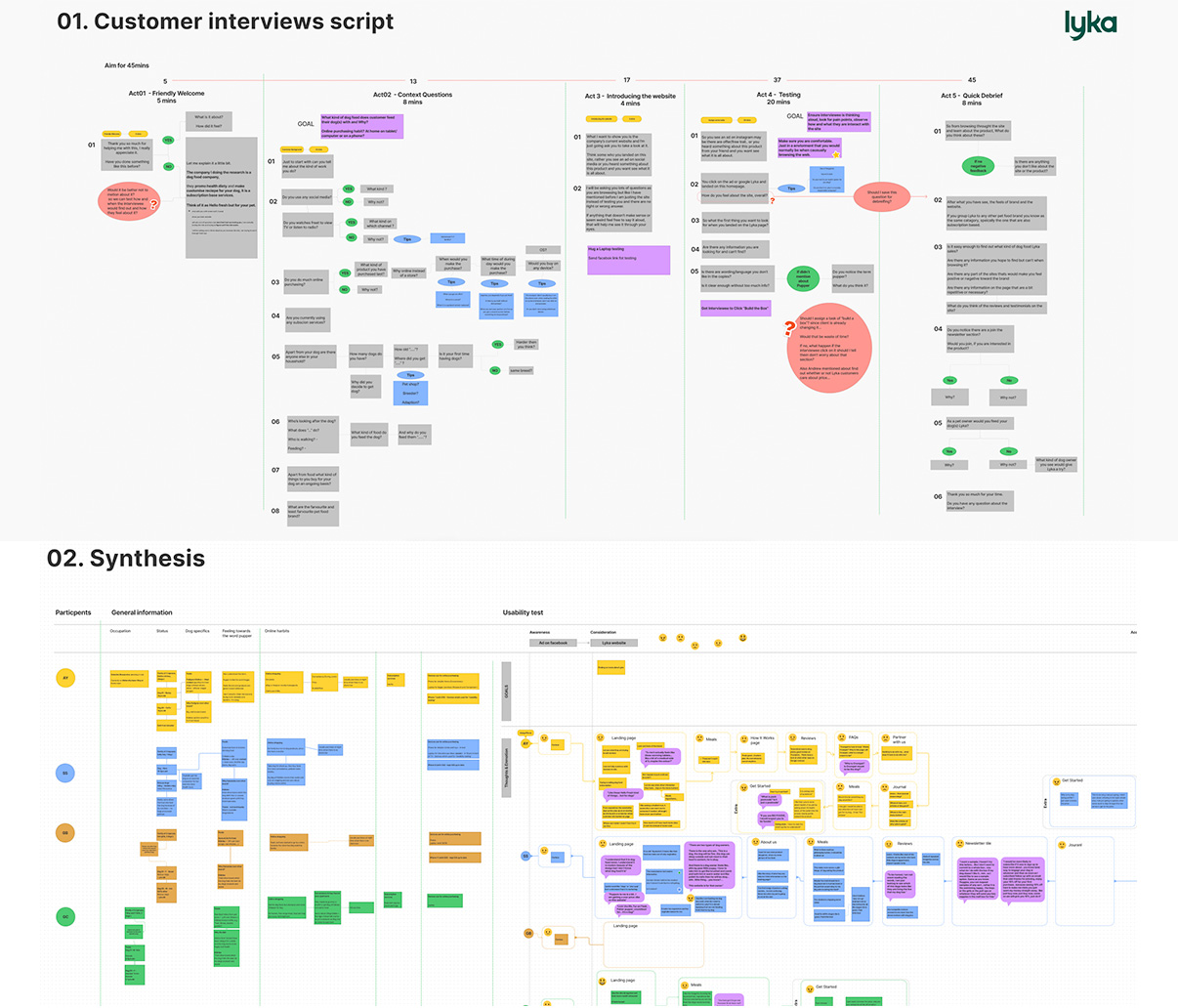
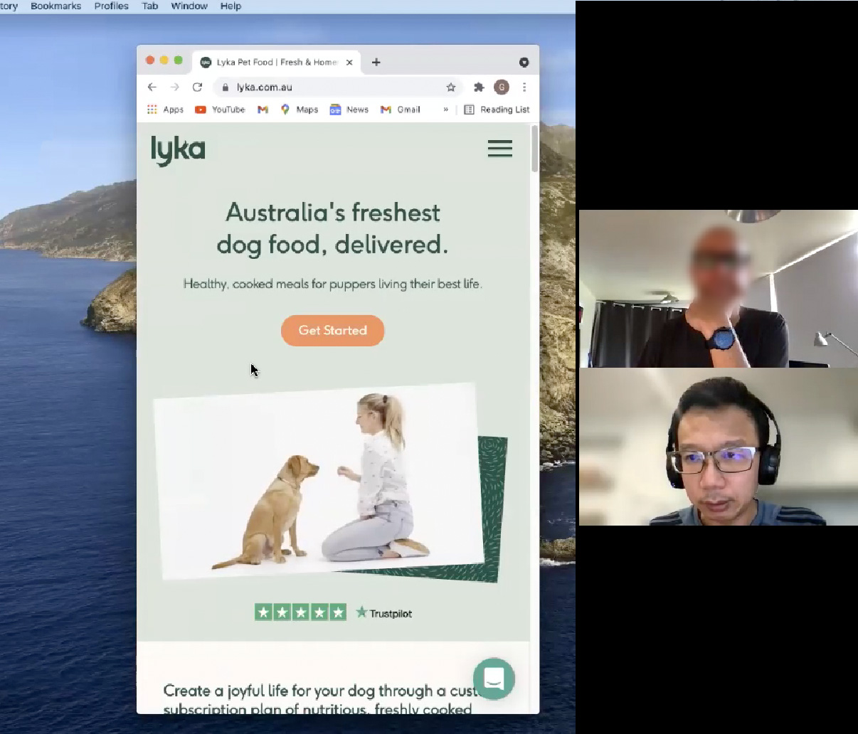
Above: Interviews script and synthesised notes from the interview, screenshot of usability testing on the existing Lyka site.
Synthesised all customers’ data as a team, we identified two customer groups and created their journey maps.
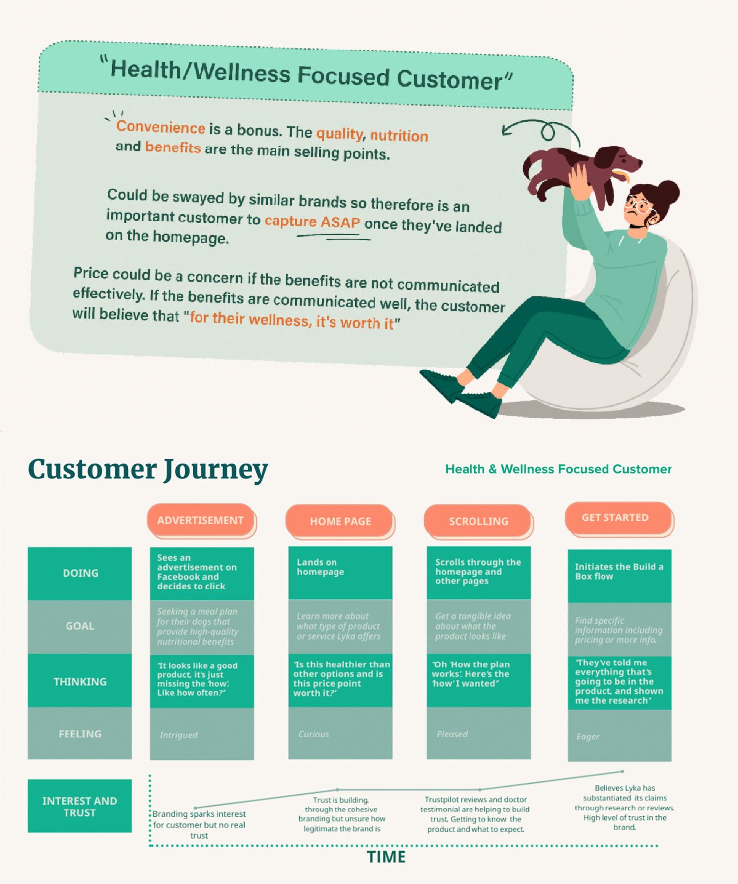
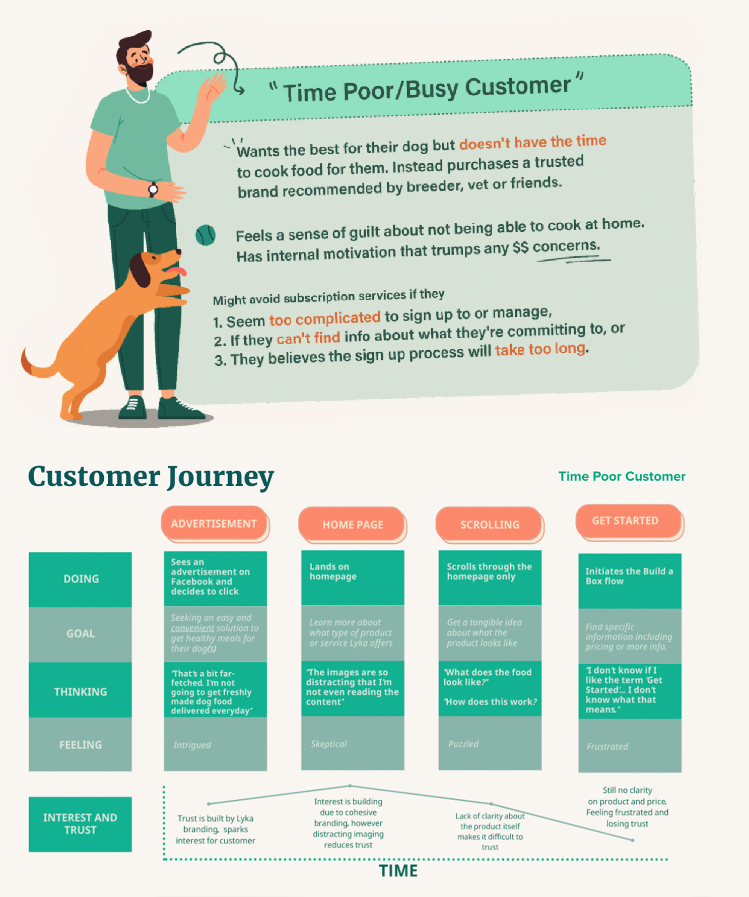
We compared the customers’ needs with Lyka’s business objectives gathered from the first stakeholder’s interview. Where the two groups overlap lies opportunities to improve.
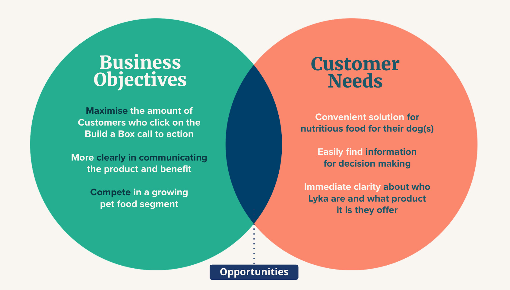
As a team we distilled to three key insights
-
Better user experience on landing page & amending the CTA
Common pain points suggest “clutter” and excessive length on the homepage, especially when accessing on mobile.
Frustration on changing navigations throughout the site and confusion on naming CTA “Get Started”.
-
Clearly & quickly communicate product offers & benefits
Customers have indicated uncertainty about price, delivery, and ingredients.
An opportunity exists to implement some form of pricing guide for time-poor customers to gain their trust before committing to BAB flow.
-
Relocate the newsletter button and specify its function
Communicate what is entailed in the Newsletter transparently.
Drive customers to sign up voluntarily.
Based on what we learnt we then created a “How Might We” statement to set a benchmark and better help clients to visualise what we are trying to achieve for the final product.
How Might We...
Create: an irresistible and exciting way
For: dog owners, almost anywhere in Australia
To: make the impossibly easy decision to build a box and place their first subscription order
And improve: the health of their dog, their trust in the Lyka’s brand
03 Design Process
Initial thinking
With key pain points defined, we started the ideation phase as individuals.
I came up with these goals to address those UX problems.
More information with less scroll.
Mobile first design approach.
Summarise information to key points & make detail content collapsible.
Reorder section tiles according to its hierarchy with additional BaB CTA fixed on top nav bar.
Front-load part of "BaB" (Build a Box - A component that helps customer to customise the meal plan for their dog).
Current “Meal Planner” front-load some of the BaB flow features. With some modification, it could be possible to provide serve portion and pricing and help streamline the BaB flow.
This will save time while allowing Lyka to be more transparent with pricing upfront.
Better way to explain product & benefits.
Prepare and manage customer’s expectations before they go down to the BaB flow.
“Lyka sells subscription based wet food for dogs and delivers to your door. When clicking on BaB flow you will have to answer few questions so we can work out the price and perfect portion for your dog”
Design process from wireframing, low to mid fidelity prototyping and usability testing
Findings from usability tests
After conducting some usability tests with my mid-fi prototype, these are the main feedbacks from the interviewees
-
More clarification on the kind of dog food Lyka sells.
-
My original idea of front-loading the serve portion customising/price calculation features from BaB flow in the Meal Planner tile was a bit convoluted. Although the customer needed the pricing upfront, however, were not prepared to answer specific questions to obtain the price. They would prefer a more streamlined approach for a price estimate instead
-
Amalgamating the "How lyka works" with other information to minimise the page scroll, creates confusion and key information were too hidden away.
In summary
It always comes down to these three main questions
"What kind of dog food?"
"Why do I have to give out information to get the price?"
"How How do I get them delivered?"
It is crucial to answer them in an intuitive way with limited scrolls. We must give satisfactory answers to these questions before providing other additional information. With that in mind, I was set to do my final iteration in high fidelity
High fidelity prototype
01 - Beginning section
Updates includes:
Quick note to “discount offer” as an incentive to newsletter sign up. It moves behind the fixed nav menu as customers scroll down
Provide visual cues of the product in different form - At your door step, per serve pouch & served as meal.
Wording adjustment on Header and body copy to help better clarify the service and the product.
Answers the most pressing questions as bullet points with expandable detail content.
02 - Middle section
Updates includes:
Providing price guide with half serve option in Meal Planner tile
Front-load filter features from BaB flow into Recipes tile
Easily accessible CTA buttons through this section
03 - Bottom section
Updates includes:
Detail information
Providing link to relative page for more details on the topic
Reminder for newsletter sign up
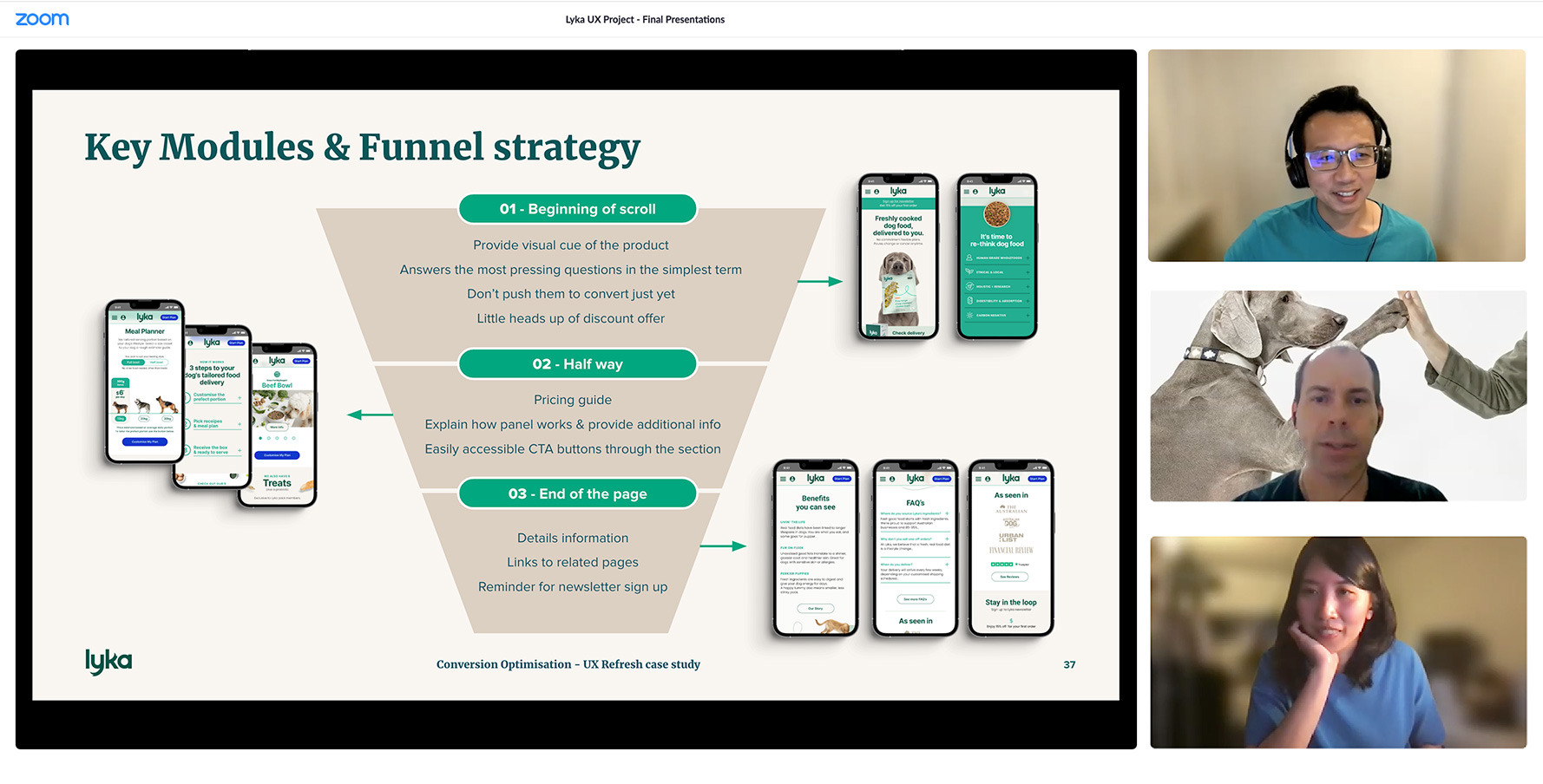
Final client presentation
At the end of this project I gave a 15mins presentation to Cindy (Design Director) and Lorenzo ( Senior Product Manager) from Lyka which briefly recapping the key research findings before spending the majority of the presentation discussing the key design decisions and demonstrating the high fidelity prototype. Clients was inpressed with design in particular of surfacing the meal receipe filtering funcition out of the "build the box" flow, since lots of their prespective customers who landed on Luyka's homepage because of their dog's health issues by providing them a way to know more about the product and found out whether or not it is suitable for their dog's condition
One last round...
Uitilising Askable and testing platform Maze, I conduct one more test with this High-Fidelity Protoype.
Feedback was very positive, there were only few more points which the customer would like work on.
Comment - A customer would like the food to be more specfic listed as (e.g. wet mince)
Thoughts - Add fine detail of the product in the first tile with more descriptive sub-header (e.g. what is Lyka?)
Comment - Unable to find information on delivery date or frequency.
Thoughts - Delivery information calculated based on customer's inputs during the BaB customisation flow, however, an estimate frequency of delivery can be incorporated in "Meal Planner" tile to give customer an estimate.
Comment - Provides product's shelf life information.
Thoughts - Information can also be incroperated in in the first tile under "What is Lyka?"" sub ahead.